
In modern Feng Shui, colors are not just aesthetic choices — they are symbolic expressions of the Five Elements: Metal, Wood, Water, Fire, and Earth. Selecting and combining the right color tones in office design promotes energy balance, productivity, and contributes to both E (Environmental) and S (Social) criteria in ESG. For global enterprises aiming toward sustainable development, this design approach is essential.
Ideal for finance or legal departments, these tones convey clarity and focus.
E: Light tones like white or gray reflect illumination, reducing lighting energy consumption.
S: Clean, minimalist spaces enhance professionalism and comfort for employees.
Activates Wood energy — innovation and vitality, suitable for R&D or HR zones.
E: Green tones evoke nature, relieve visual strain, and enhance biophilic harmony.
S: Inspires creativity, mental relaxation, and positive communication among staff.
Best for legal or administrative departments requiring deep focus.
E: Cool colors ease eye fatigue in long work hours.
S: Reduce stress, balance emotions, and support cooperative engagement.
Ignites Fire energy — ideal for marketing teams and creative meeting rooms.
E: High reflectivity supports efficient lighting but should be moderated to prevent glare.
S: Stimulates enthusiasm, teamwork, and innovative thinking.
Perfect for reception areas, corridors, or HR offices.
E: Neutral shades integrate easily with other materials, promoting design simplicity and material efficiency.
S: Evoke warmth, reliability, and a welcoming ambiance for users and visitors.
Natural light tones (white, beige, green) reflect light efficiently, lowering artificial lighting needs.
Cool-toned interiors (greens, blues) ease visual fatigue and reduce air-conditioning energy — aligning with resource-saving design.
Color psychology is well-documented: blue fosters concentration, green sparks creativity, yellow/orange inspires motivation.
A harmonious color palette enhances well-being and mental comfort, reducing stress and sick leave — supported by ergonomic and color psychology research.
 |
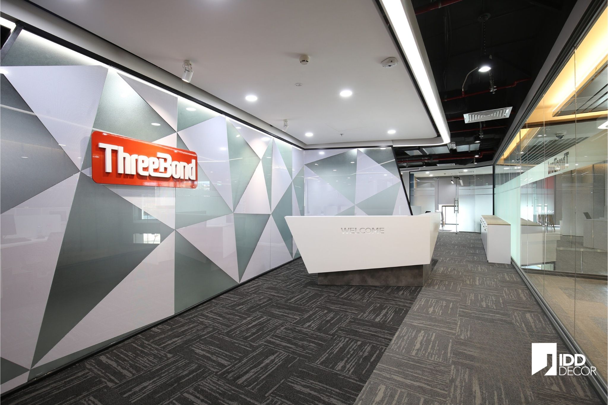
ThreeBond Vietnam OfficeMain palette: White, gray, and red — drawn from the brand logo.
|
|
|
|
||
Constellation – Publicis GroupMain palette: Black and yellow (not blue as previously mistaken).
|

|
Define Color Goals (#Goals): Identify the energy type to be enhanced — creativity, focus, or stability.
Apply the 60-30-10 rule: 60% dominant tone, 30% secondary, 10% accent — based on thespruce.com color psychology and design standards.
Match colors to department functions:
Marketing: Yellow, light orange
Finance / Legal: Blue, gray
R&D / HR: Green, white
Combine greenery (Wood element) and natural lighting to reinforce Feng Shui and ESG synergy.
Avoid overuse of intense red or black tones that may cause stress or eye fatigue.
Control lighting intensity and color temperature from LED systems to maintain accurate color perception.
Ultimately, it builds a positive corporate culture, showing that the organization values both people and the planet.
Feng Shui color design is more than aesthetic decor. When applied scientifically through the Five Elements, it becomes a “soft tool” linking office interiors with ESG goals — improving environmental performance while enhancing employee well-being.
With proven experience from projects such as ThreeBond, and Constellation, IDD Decor offers ESG-integrated color solutions customized for each department — optimizing both aesthetic and operational energy.
IDD Decor – Office Interior Design – Behind the door awaits the path to success.
📍 Doxaco Building, 307B Nguyễn Văn Trỗi, Tân Sơn Hòa Ward (Former Ward 1, Tân Bình District), Ho Chi Minh City
📞 Hotline: 0896 640 986
🌐 Website: idddecor.com
🔗 LinkedIn: linkedin.com/company/idddecorvn